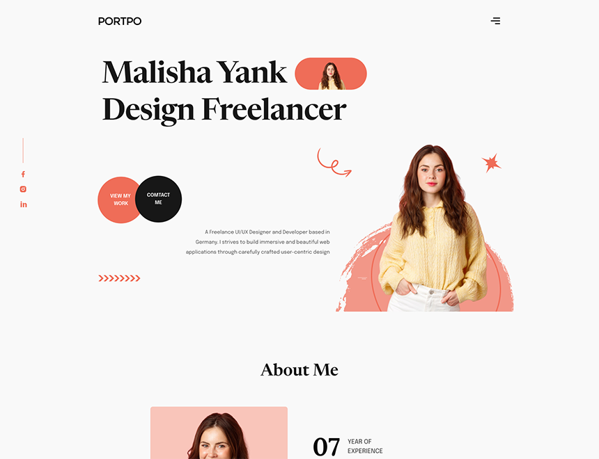
Overview
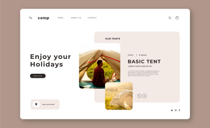
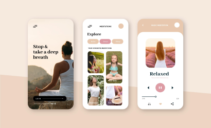
Minimalism combined with elements of french typography and brutalism helped us to realize the site exactly as we imagined with the client at the beginning: visually restrained, but stylish. Informative and pleasant to use, with an elegant aftertaste of a serious financial institution. Combined with elements of french typography and visually restrained, but stylish. Informative and pleasant to use, with an elegant aftertaste of a serious financial institutional client, and close collaboration.
- Marketplace startups
- Advantage
- Accomplished
Typography
Visual hierarchy is the principle of arranging elements to show their order of importance. Designers structure visual characteristics—e.g., menu icons—so users can understand information easily. By laying out elements logically and strategically, designers influence users’ perceptions and guide them to desired actions. Users notice larger elements more easily can convert.
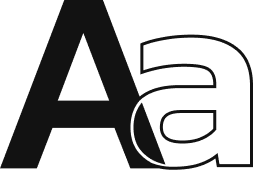
- Regular This Is Text Message
- Medium Medium Typography
- Semi Bold Just Amazing
- Blod Awesome
